Wardrobe Architect Week 12: Adding Accessories

Rather than making a list of requirements for my functional and decorative accessories and deciding how many I need of each, I’m going to focus on the things I think are missing from my current accessory collection. The items below are more inspiration than specific shopping list, especially since accessories are, by definition, not essential and therefore not as high on my to-make-or-get list.

Hat & Sunglasses

2015-06-24_01_Hats-and-Sunglasses


Ultrafino Monte Cristo Straw Fedora Panama Hat // Ray-Ban RB2132 New Wayfarer Sunglasses

I’m fair-skinned and fair-haired with light eyes, so these are a no-brainer. I really like how I look in hats, but I only own one: a lightweight athletic hat I picked up for a trip last summer, more practical than pretty. I think I’d like to get something with a slightly tailored fit (rather than a big floppy-brimmed number), like a straw fedora or a Panama hat.

On the other side of the equation, since I got contacts and can finally wear whatever sunglasses I want, I’ve been paralyzed trying to find a pair I like. Everything I’ve tried either overwhelms my face, or doesn’t feel at all like me. I don’t need trendy or statement-making shades, I just need something that doesn’t make me look and/or feel like an idiot! Suggestions welcome.

Shoes

2015-06-24_02_Shoes

Dr. Scholls Friendly Striped Ballet Flat // Audrey Brooke Newport Metallic Flat
Me Too Buckle Reptile Ballet Flat // Franco Sarto Jinelle Flat Sandal
Franco Sarto Jinelle Flat Sandal // Crown Vintage Marley Flat Sandal
Kelly & Katie Brice Wedge Sandal // Kelly & Katie Madeline Wedge Sandal

I’ve been living in a pair of black ballet flats since the weather turned warm. Before they completely fall apart, I’d like to pick out a new pair or two in my new palette. The navy and white stripes are right up my alley, but gold and red are both versatile choices that I’ve been meaning to add to my collection for a while. I wish I could rock a pair of boat shoes, because I think they’re quintessentially summer attire and I hear they’re pretty comfy, but every pair I’ve tried on just didn’t look right. *sigh*

I’d really, really like to get a pair of flat sandals this summer. I have a pair of white slip-ons, but they’re not great for a lot of walking because they’re slip-ons—I need some kind of security otherwise I’m liable to fall off my shoes. I love that sandals come in a rainbow of happy colors these days. What I don’t love is that so many styles are just so dang uncomfortable! I’ve avoided thong styles and their accompanying chafing, but it’s a crapshoot whether the insoles on most sandals offer any cushioning. Here’s hoping this summer’s search is more fruitful than last year’s.

Finally, I’d like to throw in a pair of low wedges for variety. Anything to occasionally lengthen the ol’ leg line is much appreciated by this petite.

Bags

2015-06-24_03_Bags

Striped Weekender Handbag – Gray // Vertical Buckles Backpack Handbag // Tote Handbag with Strap

Strictly speaking, I don’t need any more bags, but I do love them so, and it’s nice to have a bag suited to every purpose and occasion. For example, Justin and I make a weekend trip to visit family every couple of months, and we usually share a rolling suitcase for our stuff. Sometimes it isn’t big enough, but the next size up in the set is way larger than we need for such a short trip. I used to have utilitarian duffel bag, but it was retired when the strap on it broke; it would be nice to replace it with something pretty. A small, backpack-style bag would be nice for outings to the flea market or along one of Raleigh’s many greenways, because I could bring my usual kit while leaving my hands free and avoiding the switch-shoulders-every-15-minutes game. Bonus: both the weekender and the backpack coordinate with a wallet, purse, and tote I already own—matching for the win! The green purse is just for color, since all of my other purses are neutral.

Jewelry

Anything colorful and a little statement-making. Natural materials and textures, like leather, are fun too. I definitely favor graphic over intricate or ornate. Beyond that, I don’t know. There are so many pieces of beautiful handmade jewelry online that I have no idea how to narrow it down, let alone choose.

That about sums it up. Ours is not a climate for scarves, even lightweight ones (too humid), so these are the things I reach for when I head out the door in the morning.

Do you use colorful accessories to mix things up and keep outfits fresh, or do you tend to stick to neutral accessories and wear more interesting outfits? Maybe you go for head-to-toe neutrals for a timeless look that goes with anything, anywhere?

Creating Two-Tone Tables with Paint + Stain

As the first children to move away from home in our respective families, Justin and I have been the lucky recipients of hand-me-down furniture to furnish our various apartments. Some pieces came from our parents’ garages, remnants of decorating upgrades that hadn’t quite made it to a yard sale or thrift store. Others were freebies from friends who were moving and didn’t have space for them in their new digs. Our coffee table and two end tables fall into the latter category: a dear friend of my parents was down-sizing and wanted to pass them along rather than go through the trouble of selling them, so we gratefully accepted her generosity (while secretly high-fiving each other because we could swap out the stacked moving boxes we had been using as tables without spending a dime).

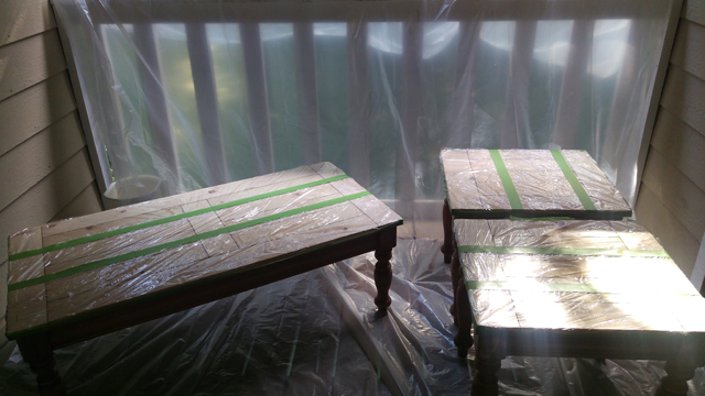
We’ve had the tables for nearly six years now, and they’ve served faithfully. But they definitely weren’t much to look at:

2015-06-21_01_Tables-Before

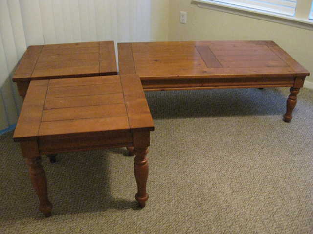
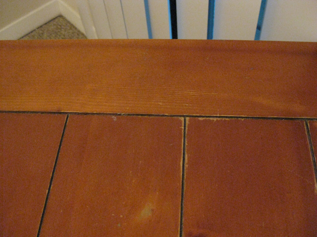
The orangey stain wasn’t our favorite (is it anyone’s?), but what really counted against them was the condition of the tops. On closer inspection you’ll see there was water damage…
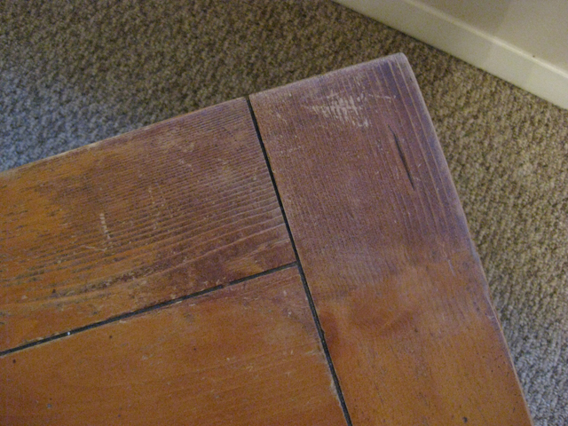
2015-06-21_02_Water-Damage

…scratches…

2015-06-21_03_Scratches

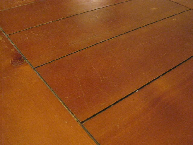
…and chipped/scuffed stain.

2015-06-21_04_Chipped-Stain

Oh my. We were tempted to replace them, but everything we liked was a little out of our price range for now, and these tables still had plenty of useful life in them. I mean, they can still hold a lamp and a cold drink, so there was no call for sending them to the curb just yet. The only question that remained was whether to stain them or paint them. I couldn’t decide which idea I liked better, so I decided to do both: whitewash stain for the tops and a fun paint color for the legs. And since our living room is crying out for more color (rentals—what are ya gonna do?), I decided to spend a little extra money, take a bit of a design risk, and do the coffee table in a different color than the end tables.

I turned to veteran furniture makeover-er Kate of Centsational Girl to help me pull together a list of necessary materials. Although she’s done a couple two-toned pieces, her post on a blue bureau and her favorite furniture paint was the jumping off point for my own makeover process.

2015-06-21_05_Makeover-Supplies

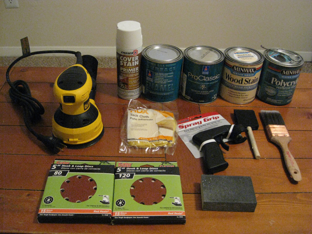
The sander, a DEWALT 5-inch variable speed random orbit sander (ROS), was purchased specifically for this project. I picked up 80 grit and 120 grit sanding discs at the same time, but later went back for 60 grit and 220 grit. I had the medium-grit sanding block from a previous project, but ended up buying 120 grit and 220 grit sandpaper because they were easier to maneuver around the tables’ curvy bits. I bought the spray grip for the primer on Kate’s recommendation, and I don’t think I’ll ever spray paint without one again, because it makes the process so much less hand-cramp-inducing. The foam brush was for the stain, the synthetic bristle brush was for the Polycrylic, and a short-handled natural-bristle angle brush (not pictured, whoops!) was for the paint. Also not pictured: drop cloth, respirator, safety goggles, and cotton rags.

Now for the fun bit: the paint and stain choices. Kate recommends a water-based alkyd enamel for furniture. It’s more expensive than latex, but it dries harder, which means no perpetually slightly tacky paint that tends to stick to anything left sitting on it too long. She notes that it’s especially good for things that will get a lot of use, like tabletops and dressers. Now, I wasn’t planning to use the paint on the tops of the tables, but we tend to drag and push on the coffee table a lot, and I know that I can get a little wild with my vacuuming, so I wanted a finish that wasn’t as likely to scratch, chip, or peel over time.

Of her two paint recommendations, I decided to go with the Sherwin Williams ProClassic Interior Waterbased Acrylic-Alkyd Enamel, because I know that Lowes sells SW paint. Well, it turns out they sell a very limited selection of it, and that’s not one of the products they carry. So I hit up an SW store to get swatches of colors I’d checked out online (an aqua and a dark teal) and get the paints mixed. When I went to place my order, the associate explained something that Kate doesn’t mention in her how-to: the ProClassic Interior Waterbased Acrylic-Alkyd Enamel is only available in the Extra White base, which means it can’t be used for dark colors like the teal I had picked. They gave me two alternatives: the ProClassic Interior Acrylic Latex Enamel, which comes in both the Extra White and Deep Base, and the All Surface Enamel Latex, which only comes in the Deep Base. Both are water-based products that dry hard like traditional oil-based enamels.

The ideal choice would have been to go with the Interior Acrylic Latex Enamel for both colors, but they were completely out of the Deep Base in satin finish—my preference for this project—and weren’t expecting any for at least a week. Being the impatient person that I am, I bit the bullet and decided to do the the lighter color in the Interior Acrylic Latex Enamel and the darker color in the All Surface Enamel Latex. I figured it would be a relatively low-risk way to see if I liked one over the other, because if I completely hated it, I could always go over it with a different paint and pretend that the first try never happened.

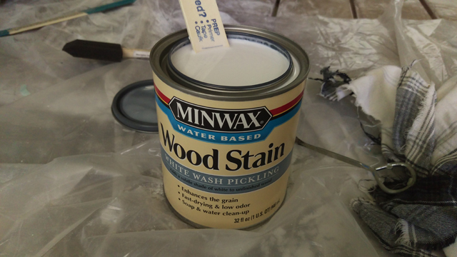
For the stain, I chose Minwax’s Whitewash Pickling Stain. It imparts a nice color that reads as white but still allows some of the wood grain to show through. Conveniently, it’s is also water-based: I already had half a can of Polycrylic left from a previous project that I could use for the topcoat, and I’m big on easy clean-up.

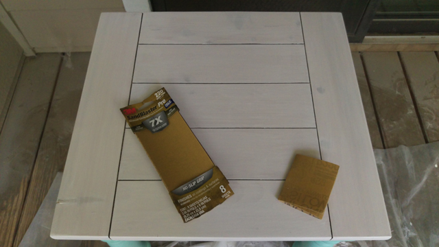
The first step was to sand the tops down to bare wood. I attacked them with the ROS with progressively finer sandpaper, starting at 60 grit and working my way to 220 grit. This took more patience then muscle, but it definitely took several evenings after work before I’d stripped all three tops. I then completely failed to take a photo of the stripped tops (or lost it somewhere between the camera and computer), so you’ll have to use your imagination.

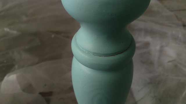
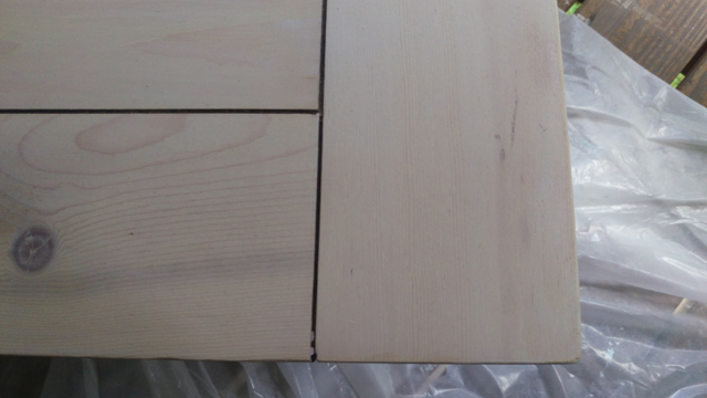
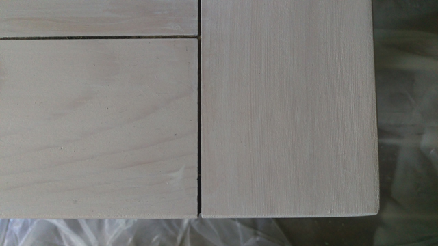
Because the tops have a lip that hangs over the edge of the base by about a half inch, I flipped the tables over and sanded the underside of the lip as well.

2015-06-21_06_Detail-Sanding

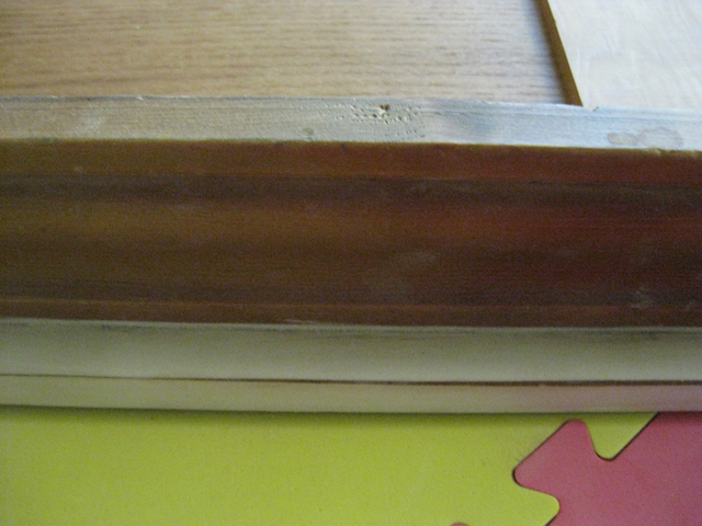
To get that skinny line between the faces of the lip, I used a medium-grit sanding block and moderate pressure.

2015-06-21_07_Detail-Sanding

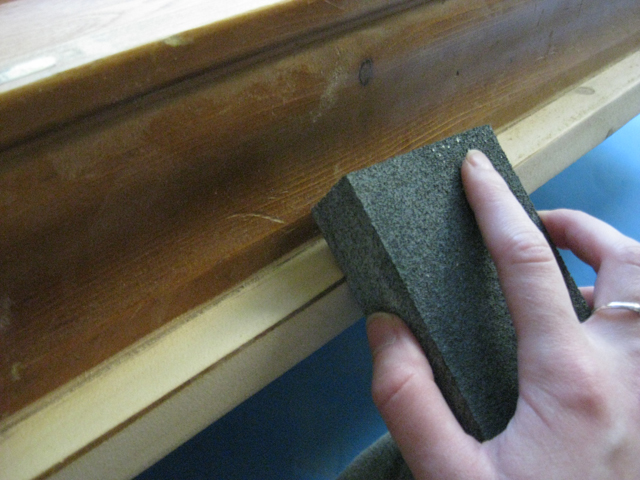
(You smart people undoubtedly know this already, but it bears repeating, if only as a reminder to myself: take off your jewelry before you do any hand-sanding. The underside of my ring got pretty scuffed from this part of the job.)

I also used 120 grit sanding sheets to rough up the rest of the table to take some of the shine of the topcoat off. This probably wasn’t strictly necessary considering I used Zinsser Cover Stain Primer, which the internet leads me to believe can adhere to and cover up basically anything. But it didn’t hurt either, so rough up at your own discretion. I followed up with a tack cloth all over all pieces to remove the sanding dust.

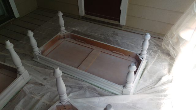
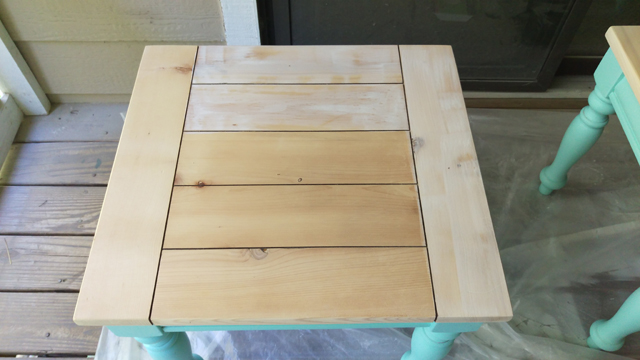
I chose to paint first and stain second, following the Kate’s lead on a similar (but less complicated) two-tone table makeover. To avoid any painting boo-boos, I covered the tops of the tables with plastic cling film and sealed the edges with Frog tape.

2015-06-21_08_Prepped-for-Priming

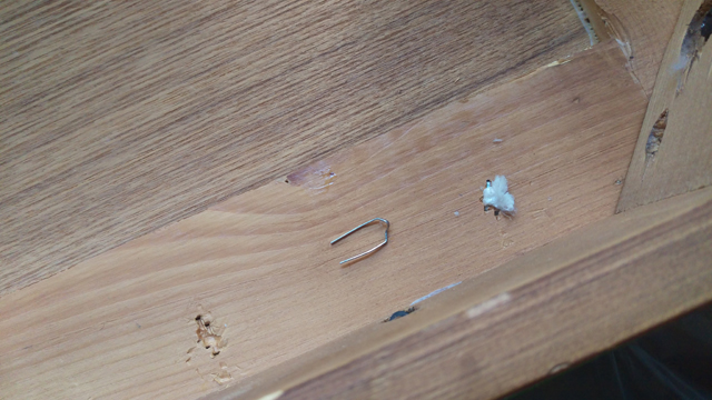
The wood underneath the orange stain was lovelier than expected, and we considered leaving it unstained and simply sealing it. But the plan won out, so I flipped everything over to prime the bases. It was only then that I realized there were several staples poking out, some of which trapped bits of plastic and old tags. I went ahead and removed those just to avoid any stabbed or sliced fingers down the road

2015-06-21_10_Removing-Staples

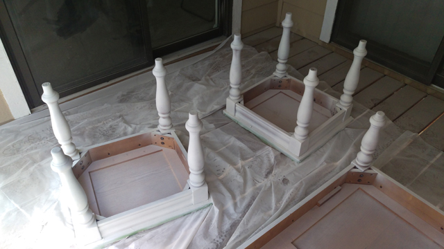
Once coat of primer provided decent coverage where I got the table…

2015-06-21_11_One-Coat-Primer

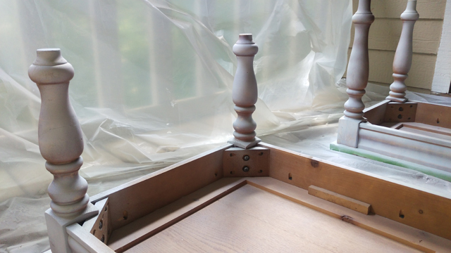
…but the curvacious legs made it difficult to get into every corner, and I was running low on primer by the time I made it around to the last leg.

2015-06-21_12_One-Coat-Primer

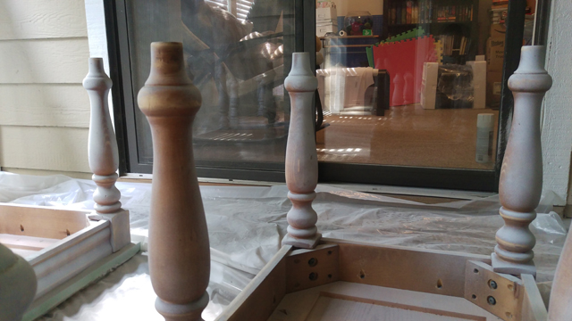
A second can and second coat of primer did the trick.

2015-06-21_13_Two-Coats-Primer

2015-06-21_14_Two-Coats-Primer

With the prep work done, it was time to get on with the real transformation: the paint!

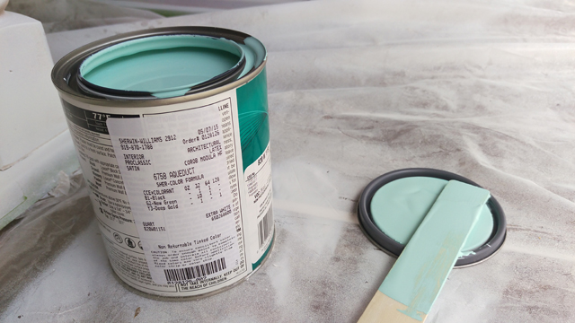
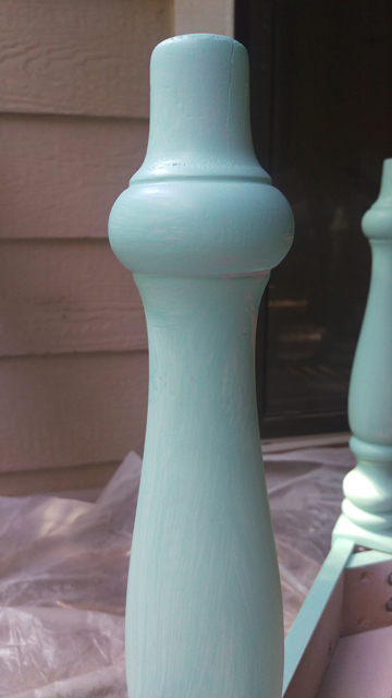
For the end tables, I chose a light aqua, Sherwin Williams Aqueduct in Satin.

2015-06-21_16_Aqueduct-Preview

For the coffee table, I chose a dark teal, Sherwin Williams Grand Canal in Satin.

2015-06-21_17_Grand-Canal-Preview

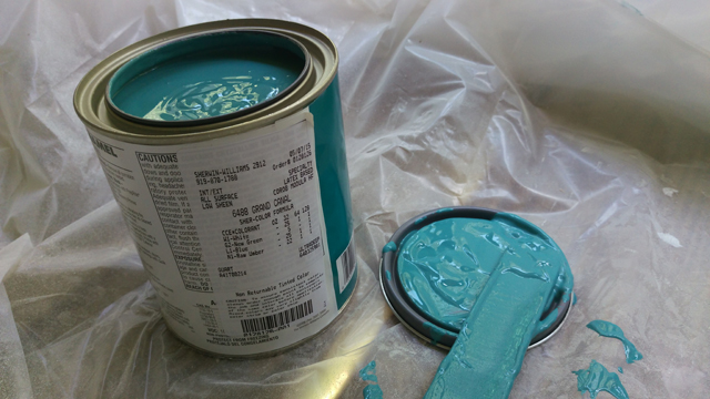
From the names alone, I knew they belonged together. I did panic a little when I started to actually paint because they went on lighter than they appear in the can, but like any other paint they’re darker dry than wet. The swatches were to true to life, which was a relief.

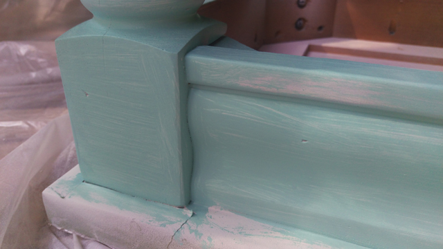
If you compare those two images, however, you can probably tell that those paints do not have the same viscosity. The ProClassic Interior Acrylic Latex Enamel is similar to a latex wall paint, but the All Surface Enamel Latex is the consistency of warm ketchup. As a result, it was more difficult to get thin and even coats with the latter. I resorted to vigorous back-and-forth brushing to spread the paint, rather than long parallel strokes, which left visible brush marks; combined with the dark color, this meant more coats were necessary to get full and even coverage.

To illustrate, here are the end tables after one coat:

2015-06-21_18_One-Coat-Aqueduct

2015-06-21_19_One-Coat-Aqueduct

And here’s the coffee table after one coat:

2015-06-21_20_One-Coat-Grand-Canal

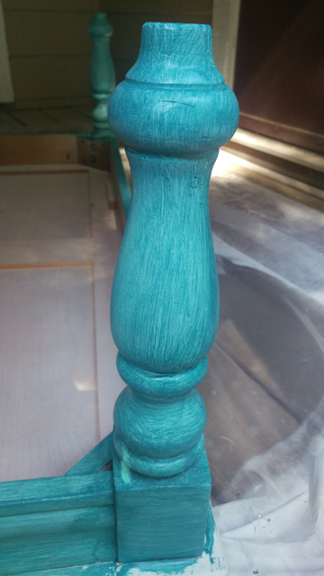
In total, the end tables required two coats and the coffee table required four. You have to wait four hours between coats with both products, so it definitely slowed down the process.

Once the last coat had dried, I noticed there were still a few spots that hadn’t taken paint.

2015-06-21_21_Two-Coats-Aqueduct

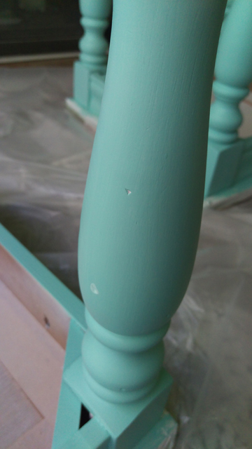
(Some may choose to fill dents like these with wood filler before priming. I didn’t bother. I think they add character. Also, there are a bunch of them, and all of them are pretty inconspicuous, so the payoff didn’t seem worth the extra time and effort. Your mileage may vary.)

2015-06-21_22_Two-Coats-Aqueduct

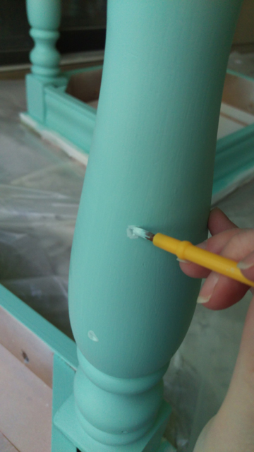
I picked up cheap (but not too cheap—they still have to be soft) watercolor brushes at the local craft store to touch up the nooks and crannies.

2015-06-21_23_Two-Coats-Aqueduct-Touch-Up

Once everything had dried for at least 24 hours, I peeled off the protective plastic cover and cracked open the stain. It’s runnier than paint but not as thin as water; it’s probably closest to Polycrylic in stir-ability.

2015-06-21_24_Whitewash-Preview

I used a cheap foam brush to apply the stain; I aimed for thin and even coats. The instructions say not to allow it to sit for more than 3 minutes before wiping. Now, I generally regard these kinds of instructions as guidelines only. In this case, however, I would say that they are not kidding. The minute you brush on the whitewash stain it starts to become unbelievably sticky, so if you don’t wipe it off within three minutes it’ll be too gummy to get it off properly. I paused to take the photo below while applying the first coat and regretted it. When I went to wipe off the excess, it smeared and left uneven patches of color. They were especially noticeable because the first coat is so subtle.

2015-06-21_25_Whitewash-Application

Here’s two coats.

2015-06-21_26_One-Coat-Whitewash

The third coat is more discernible, but still quite faint.

2015-06-21_27_Two-Coats-Whitewash

I liked that the wood grain was visible, but I didn’t like how faint the white was after three coats. At this point, I decided to gamble. I’d had great success staining pine nightstands a rich espresso color by using Varathane’s water-based stain in Kona and simply brushing it on and then leaving it to dry. So I painted on another coat of the whitewash, this time quite thickly so that the stain would stay wet on the surface longer and allow me to go back and smooth out lap lines, and didn’t wipe it at all. (So rebellious, I know.) Lo and behold, the sky did not fall, the tables did not catch fire, and no one broke down my door to arrest me for ignoring the label.

Ultimately, the nightstands got five coats of whitewash (three light coats + two heavy coats) and the coffee table got three (one light coat + two heavy coats). There’s no distinguishable difference in final color.

One downside to this approach was that I ended up with stain in the cracks (for some reason, the cracks repelled any little drops of stain when I used a lighter hand). I was afraid of damaging the surfaces by scraping the cracks with something sharp like a straight blade, to say nothing of dulling the blade, so I used a plastic knife to chip out the stain. Well, peel it out is more apt, since the gobbets in the cracks were sticky.

The last step was to lightly sand the whitewash, which was slightly tacky even after fully drying, with fine sandpaper to prep it for the topcoat.

2015-06-21_28_Prep-for-Sealing

I followed up with a tack cloth, then a damp rag, then a dry one. To be extra sure there was nothing lurking in those cracks, I used our regular vacuum cleaner to them a once over.

I applied two coats of Polycrylic with a synthetic-bristle brush over the painted and stained portions of the tables. Because we had a spate rainy days, I brought everything inside to seal and dry—don’t worry, I made sure the living room floor was covered and the air was well-ventilated—so there are no photos of this step.

Everything got another 48 hours or so to fully cure. What had once looked like this…

2015-06-21_01_Tables-Before

…now looks like this!

2015-06-21_37_Coffee-Table-After-Collage

2015-06-21_38_End-Tables-After-Collage

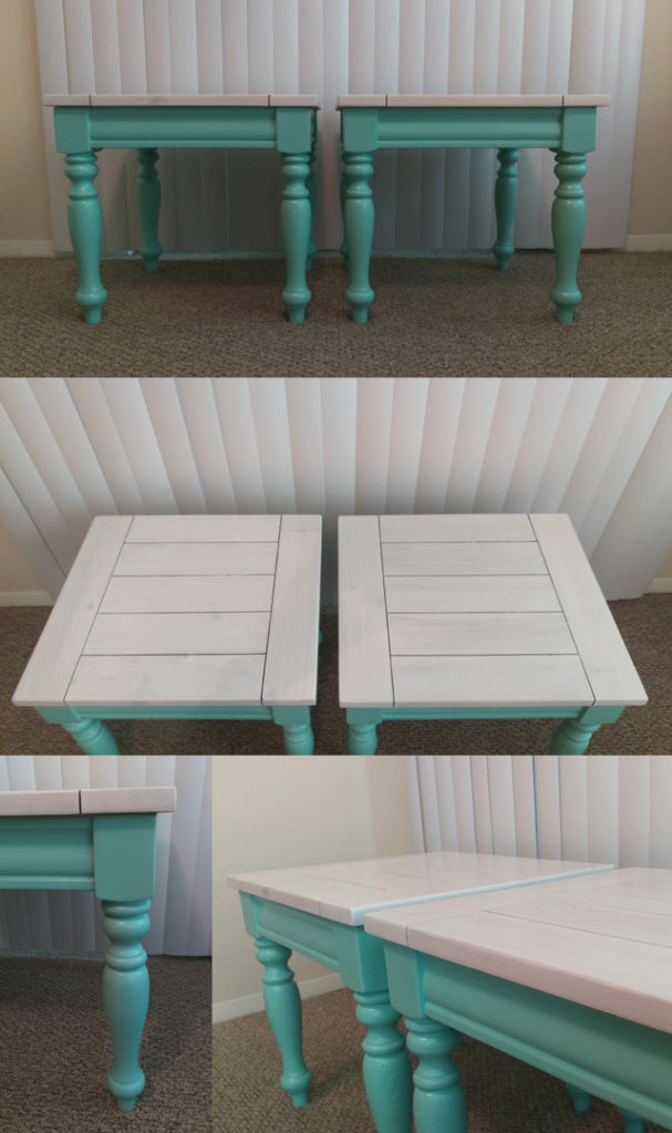
A huge improvement, no?

This was definitely a learning experience, and if I were to do it again, there are some things I would do differently (not the least of which is avoiding anything that has so many crevices that must be painted or not-painted). For one thing, I’d take a lighter hand when sanding to prep for the topcoat; I wasn’t gentle enough in spots and the wood shows through ever so slightly along a couple of the edges. For another thing, I would be more careful with the vacuum cleaner. While trying to get every last bit of dust out of the cracks, I left a few dark scuff marks, but I didn’t notice them until after I started applying the topcoat, so they’re sealed in forever. Is the finished product less than perfect? Yep. Are these things deal-breakers? Absolutely not! It’s all par for the course.

We’re so pleased to have the tables back in use and looking so pretty. They are, however, putting the lamps and throw pillows to shame, so I’m hoping to give those a little TLC next. Cheery colors for all the things!

Outfit Along 2015

As my Wardrobe Architect exercises have undoubtedly made abundantly clear, I haven’t been so good about buying or making clothes that work together over the last few years…or ever. Like a lot of people, I find a thing I need or a thing I like (preferably something that ticks both boxes) and go for it, without really considering if I can wear it more than one way. Sometimes that’s okay, but mostly it makes me one of those people that has plenty of clothing and yet has “nothing to wear.”

So when Lauren Taylor of Lladybird announced that she and Andi Satterlund of Untangling Knots would be teaming up again to host the 2015 Outfit Along, I was all over it like dog hair on a date night dress. What’s an outfit along? It’s a friendly challenge where you commit to sewing a garment and knitting a garment that are designed to be worn together. Lauren and Andi have picked a dress pattern and a cropped cardigan pattern, respectively, and throughout June and July they’ll be providing construction tips on their blogs. Participants can post their completed garments in the OAL 2015 Finished Outfits thread in the Untangling Knots group on Ravelry; garments completed by the July 31 deadline are eligible for nifty prizes and the adulation of their peers (but mostly prizes :-)).

The official sewing pattern is McCall’s M6887, which I picked up in a recent pattern haul. I’m planning to sew View A, which has an adorable back cut-out. 2015-06-20_1_Dress-Supplies

The fabric, which I believe is a cotton lawn, is something I picked up several months ago from JoAnn intending to make the Simplicity 1419, the Lisette Round Trip Dress. Sadly, that style is just not for me, as several yards of wadded up muslin will attest. Luckily, it’s enough fabric for the OAL pattern, and it’s a good match for my spring/summer capsule palette. I’d like to think I already had a burgeoning sense of my style preferences, but the reality is that it’s more of a happy accident, as I really just wanted something bright and cheery while we were still in the midst of freezing temps.

The official knitting pattern is Vianne, a cropped cardigan with a mesh back panel. It didn’t really speak to me, and I can’t help but think the mesh would look a little strange with the back cut-out. So I decided to substitute Marion, one of Andi’s other patterns.

2015-06-20_2_Sweater-Progress

Not too shabby, eh? I started knitting the first week of June, and I’m already to the point where I can start knitting the bottom band. It’s amazing how quickly something flies off the needles when said needles are US 10s. (The pattern calls for US 8s, which is already at the upper end of the range usually given for worsted weight. I went up a needle size preemptively when I swatched, but it wasn’t enough, so I went up again to get gauge.)

Unfortunately, I discovered an error in the final cable repeat on both sides: I made the cable travel too soon, so it isn’t positioned correctly to flow neatly into the bottom band. I was going to just leave the cable and slightly modify the band pattern instead, but after sleeping on it I realized that it’s going to bug me even if no one else can see it. I’m going to attempt to correct the problem without ripping out all of the rows (about 12), but if I completely flub, that will be my only option. Wish me luck!

P.S. The background of those photos is a sneak-peak at another project, a finished one, that I’ll share tomorrow.

Wardrobe Architect Week 11: Planning My Pieces

Two weeks since my last Wardrobe Architect post, yikes! With only a three weeks left in the series including this one, you may well have wondered why I didn’t post on time, especially when I’d expressed so much excitement for planning garments and outfits. I certainly wanted to, but when Wednesday showed up in the middle of the week (as it has a habit of doing) I didn’t actually have a plan. And I knew if I threw together a list of whatever popped into my head while I was sitting at the computer, I’d end up with a list of pieces I wasn’t 100% thrilled about, which is a recipe for a) making a bunch of clothes that I won’t wear, or b) going off the rails and ending up with a closet full clothes that are just as disjointed as I have now. So I mulled it over, looked through my recent pattern acquisitions again, and came up with something that I’m pretty stoked about.

2015-06-17_1_Capsule-Wardrobe

1st Row Four fitted t-shirts: one white, one aqua, one with navy and white stripes, and one red with a white print.  I’d like to try out the Skinny Bitch Curvy Chick Tonic Tee pattern—it’s designed specifically for petites, and it’s free!

2nd Row Two drapey camis made with McCall’s M6359, one in coral and one in yellow. One drapey sleeveless button-down in green; I really like the Portofino shirts from Express, so I’ll keep my eye out for one in a nice cheery Kelly green.

3rd Row Two drapey open-front cardigans, one in navy and one in smoke. It’s a toss-up whether I’ll make these with McCall’s M6084 or buy them from Express. I have two of the latter already that I really like, but I may not be able to get them in the color I want; on the flip side, I know good sweater knits can be tricky to find in fabric stores.

4th Row Three fitted cardigans in green, yellow, and white. I’m knitting the green cardigan already, and will probably knit rather than sew the other two as well. I haven’t picked specific patterns yet, but have plenty of options to choose from in my Ravelry queue.

5th Row A woven khaki pencil skirt made with Simplicity 1465; a knit navy pencil skirt made with Simplicity 1465; and a woven, elastic-waist swishy skirt in some print (not necessarily the fabric or even the color pictured) made with Simplicity 1662.

6th Row A Lady Skater dress, a woven McCall’s M7156, a knit McCall’s M7116 View A, and a knit McCall’s M7116 View C. All of the fabrics are just placeholders, although I’ll probably be looking for things in similar colors and patterns.

7th Row Two pairs of shorts, one in navy ikat (totally ripping off Lauren here) made with the Grainline Studio Maritime Shorts pattern or similar, and one in white, which I already own. Two pairs of leggings, one in smoke and one in navy, made with McCall’s M6173. And—if can miraculously find them in a store, be it retail or fabric—one pair of coral jeggings.

That’s a pretty ambitious list, to say the least. I doubt I’ll get through all of it by the end of the summer. The biggest hurdle will be sourcing and buying fabric and yarn, since I’m trying to sock away money for a big upcoming purchase at the same time. But I’ll go crazy if I don’t have a steady stream of projects, and my wardrobe desperately needs an infusion of new pieces, so I’ll be looking for economical ways to make this capsule wardrobe a reality. I’m open to suggestions if you’ve got them!

Pattern Haul #2: Simplicity

After my McCall’s pattern haul, I wasn’t looking to buy another lot of patterns, but then Hancock advertised a sale on Simplicity ($1.99 each, limit 10) and my resolve wavered. I know they’re known to do better sales—in fact, I just received a flyer for an upcoming one on June 20 where Simplicity patterns are going to be a mere 99¢ each—but I was already planning and scheming in anticipation of wrapping up my Wardrobe Architect series, and I knew I wouldn’t want to wait weeks or months for the next sale, so I’ve decided to regard my actions as “forethought” rather than “compulsive stashing.”

(Patterns are my stash. This, I’m sure, is a surprise to no one but me. Apparently my complete disinterest in stashing fabric and notions blinded me to my desperate coveting of patterns. While my collection doesn’t come close to rivaling those of Lauren or Sarai, I daresay I easily surpass them in glee-felt-while-sitting-amidst-the-stash-as-a-dragon-atop-its-hoard.)

Without further ado, the patterns:

2015-06-09_1_Simplicity

Top Row

1317 – A basic raglan sweatshirt pattern, because I’m already looking forward to autumn.

1425 – A basic, hackable top, because I like the idea of having options.

1421 – I’ve just transitioned from a pretty casual office to an even more casual office, but I still think it’s a good idea to have a suit in the wings for special occasions, and from time to time I like dressing up jeans with a blazer. This is a pretty thick envelope, so I’m looking forward to eventually learning some new techniques too.

Middle Row

1662 – Swishy! That is all.

1559 – Justin talked me into this one, after I spent way too much time debating between it and the one to the right of it. I tried my hand at drafting a basic pencil skirt once and wasn’t thrilled with the outcome, so I thought it might help to start with a professionally drafted version before trying to make further tweaks. Not sure if I’ll ever use the pants option, but hey, it could happen.

1465 – Another basic pencil skirt option. Between this and the previous one, I should be able to come up with my perfect version. If nothing else, one can have all the modifications for a woven skirt and the other can have all the modifications for a knit skirt.

Bottom Row

2600 – While discussing a mutual love of bags with an LYS owner recently, she shared that when she asked a friend if she should buy another tote or if she had enough already, her friend sagely replied, “One more bag wouldn’t be too many.” This is a philosophy I can get behind.

1374 – Another swimsuit pattern. I’m dreaming of luscious mix-and-match options.

5006 – This pattern is more aspirational than practical, because I have no need of a corset in my daily life, and no planned future occasion for one either. But I’ve always wanted to up my game from a Hot Topic fashion corset to The Real Deal, and now I’ll be prepared when that day comes. (I was a Girl Scout, so being prepared is everything. I also have escape plans in case of zombie and/or velociraptor attack.)

Once again I’ll send out the call: Which of these do you like best? Do you have a favorite Simplicity pattern that I should definitely plan to add to my collection?