Easily the best part of the Wardrobe Architect series is the way each assignment builds upon the previous ones. No task feels frivolous, and as I’ve worked through them my confidence in my choices, in my overall direction, has grown. Back in Week 5 I identified a color palette that speaks to me; in Week 6 I organized my palette into neutrals, nearly neutrals, and statement colors; and today I’m going to narrow my palette down to the colors I want to focus on for my spring/summer wardrobe.
Neutrals

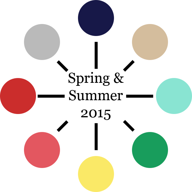
White was a given. Next I added Camel, but when I started thinking about the other colors I wanted to include, I realized that Khaki makes more sense, so I made a substitution. Justin suggested adding Graphite, but I went with Smoke instead for something a little softer and, I think, more suited to warmer weather.
Nearly Neutrals

This was a no-brainer: I knew weeks ago that my palette was going to be anchored by and revolve around Navy. I feel happy every time I look at it.
Statement Colors
I kid you not—I agonized over this section at first, which is silly, because the whole point of this exercise is to make wardrobe-building less stressful.
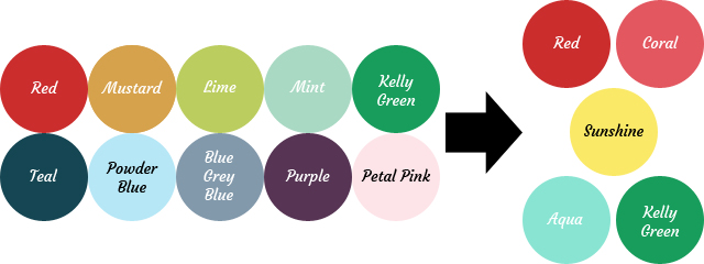
Initially I was thinking Red, Mustard, and Kelly Green, but I felt like I needed a fourth color and I couldn’t settle on one that matched enough of the others. I entertained the idea of adding Purple, but the truth is, while purple used to be my favorite color, and I have several pieces of clothing and jewelry that are purple, I find it difficult to pair with other colors. (This is probably because I’ve avoided yellow for a long time. I thought I couldn’t wear yellow because I’m a fair-skinned blonde, but I’ve since been disabused of that notion by my dear mother and husband.) I’m happy to have a few special purple pieces, but I just wasn’t excited by the prospect of making a bunch of things in that color.
Next I considered Powder Blue, Mint, and Petal Pink. I consider them all solid spring colors, and I’d definitely like to have them represented in my closet, but as the high heat of summer approaches, I’m craving bright, peppy colors instead of pastels.
I started to wonder if I’d made a horrible mistake when assembling my initial palette, since I was no longer feeling certain about the options I’d given myself to work with, and then I found Crafting a Rainbow‘s Me-Made-May 2013 wrap-up, which included a palette with several of the colors I’d been considering, plus a few I hadn’t thought of. So I shamelessly lifted some of her choices. (Thanks, Gillian!) Suddenly, everything clicked into place and I felt confident once more.
With that solved, I assembled a final palette showcasing the colors I’ll be aiming to work with over the next few months:
Seeing it all in one place makes me so excited, I kind of want to squee. I’m already daydreaming about the outfits I’ll be able to create, but I’m resisting the urge to purchase any fabric or yarn until I’ve got a more concrete plan. Soon, soon…