Rounding the corner and the finish line of the January Cure is in sight. I feel like I’ve been dropping off here toward the end, so I’m glad the official activities are nearly over so I can start scheduling things at my own pace.
Since talking about cleaning the bathrooms is boring, I thought I’d share a few ideas I’ve had for decorating the master bath. (If I had my way, we’d be painting it this weekend, but alas, the home improvement fund is rather lean after the pantry installation earlier this month.) We’ve sort of gone about things backward, since we bought new towels, a bathmat, a soap dispenser, and a toothbrush holder about nine months ago, but the walls are still beige and we could use an étagère. Here are a few ways we could fix that.
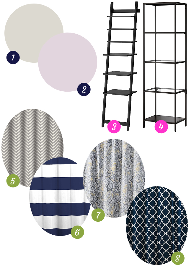
1 – Light Pewter // 2 – Peace and Happiness // 3 – HJÄLMAREN // 4 – VITTSJÖ // 5 – Chevron Shower Curtain // 6 – Cabana Strip Shower Curtain // 7 – Paisley Shower Curtain // 8 – Hampton Links Shower Curtain
The first paint color is the lightest shade on the same card as our bedroom paint color and, despite how it looks on screen, it’s actually grey, not tan. After true white, it’s the easiest choice. I’ve been thinking it could also be fun to bring in something a little different in the form of a pinky lavender like the one shown above, but I’m a lot less sure how I feel about it. I’m afraid I’ll get bored of it too quickly, and I don’t know if it will jive with whatever accent color we eventually pick for the master bedroom. But I’m kind of intrigued by the idea of creating a palette that’s a little warmer, a little softer, and a little more sophisticated than I may have originally imagined.
For an étagère, I keep coming back to this relaxed, leaning style. I don’t think it’s terribly practical as a bookshelf—not when you have as many books as I do, anyway—but for rolled towels and a basket of toiletries I think it could be perfect. For something with a little more shelf real estate, there’s the more traditional option on the right. I’d like to think the glass shelves would keep it from feeling too heavy in the small space of the bathroom. I’m even entertaining the idea of spray painting it in a metallic like Censational Girl or Bethany Seawright from Apartment Therapy’s Design Diary, who was inspired by Just Bella.
Finally, the shower curtain. I’m actually quite fond of the white one we have, because it’s made out of this lovely dense cotton gauze with a waffle weave. But the first time I washed it (in cold water) and dried it (on low), it shrank horribly. Now it doesn’t really stretch from one end of the shower to the other, and it drives me a little crazy. Okay, a lot crazy. So for fun, I looked at a few patterned curtains to replace it. The first is supposed to be grey and white; it seems to match the paint swatch well, but I’m a little afraid it’s closer to beige and cream, so I’d need to see it in person. The slightly painterly chevrons are a lot less structured than I usually go for in a pattern, as evidenced by my other three choices. The cabana stripe feels classic, as does the links pattern, though the latter may be a little overpowering and better as a bedspread rather than a curtain. I couldn’t resist throwing in a paisley, though I’d probably need a different shade of grey walls to pull it off. But the touch of yellow would be cheery in a space that gets no natural light.
It was nice to get a couple of ideas down, even if they might change, because it’s allowed me to see trends in what I gravitate toward in a way that mindless online browsing doesn’t. Do you collect inspiration in moodboards, or dive right into your designs? Have you ever been surprised by the patterns that emerge?