When I looked at colors and prints the first time around, I understood the value in narrowing things down to a “manageable” number, and several more experienced capsule creators recommended choosing palettes based on the seasons. Seemed reasonable enough, so that’s what I did. But I had a rather difficult time narrowing things down, and some of my decisions ended up being driven more by a desire to create a balanced, restrained palette than by what I was likely to wear, and trying to plan actual pieces based on this less-than-ideal palette required a degree of mental acrobatics that’s laughable in hindsight.
This time around, I didn’t restrict myself to planning for the upcoming season alone, which only makes sense when I think about how I tend to drag out individual projects. (Staying on top of sewing for the seasons is something that I can only dream about right now.) Instead, I just gathered all of my favorite colors to wear in one place:
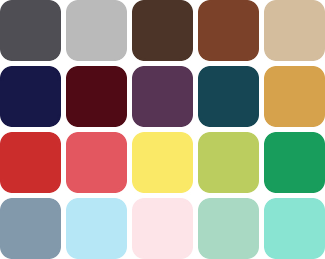
I’m sure I’ll continue to favor the darker, jewel-like tones in autumn and winter and the lighter, brighter tones in spring and summer, but seeing them all together will remind me of how things fit together, and maybe encourage me to consider less common color combinations (for me, at least) and seasonal switch-ups.
Even with such a large palette, I don’t intend to limit myself strictly to these colors, but I suspect that most purchases will easily include at least one of them. I’m also prepared to continue refining it as time goes on. I’ve already added purple back to the mix, because even though I have a hard time pairing it with other colors, I just can’t quit it. (I know that it naturally allies with yellow, but that gives me uncomfortable flashbacks to my high school’s and university’s spirit days—no thank you.) I’m also skeptical about how much lime green and powder blue I’ll actually end up with, but only time will tell.
Prints didn’t change much, but it was fun to put them all together in a fun little swatch:

Stripes, dots/spots, checks/ginghams/tartans, and large-scale florals were all clear recurring themes in my inspiration images. I especially like the unexpected pattern mixing that can happen, like a flowered skirt with a striped t-shirt. While I could certainly see myself picking up the occasional abstract, geometric, or even animal print, I think these will be my go-tos.
With inspiration, color, and pattern now more closely aligned, I feel much more confident that I can put together a plan and start to build a wardrobe. With any luck, some real live sewing and knitting might start happening around here again!