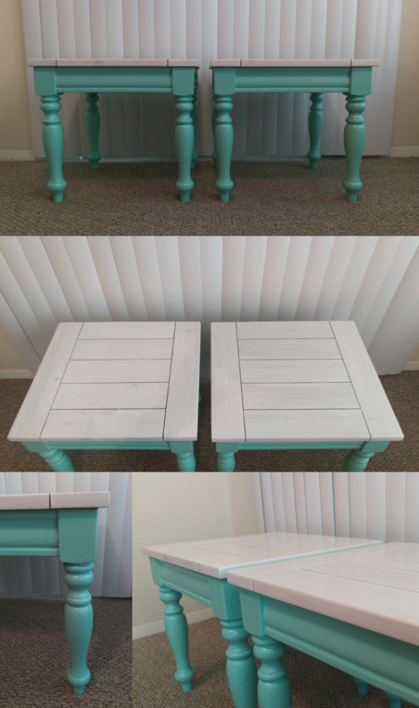
Creating Two-Tone Tables with Paint + Stain

As the first children to move away from home in our respective families, Justin and I have been the lucky recipients of hand-me-down furniture to furnish our various apartments. Some pieces came from our parents’ garages, remnants of decorating upgrades that hadn’t quite made it to a yard sale or thrift store. Others were freebies from friends who were moving and didn’t have space for them in their new digs. Our coffee table and two end tables fall into the latter category: a dear friend of my parents was down-sizing and wanted to pass them along rather than go through the trouble of selling them, so we gratefully accepted her generosity (while secretly high-fiving each other because we could swap out the stacked moving boxes we had been using as tables without spending a dime).

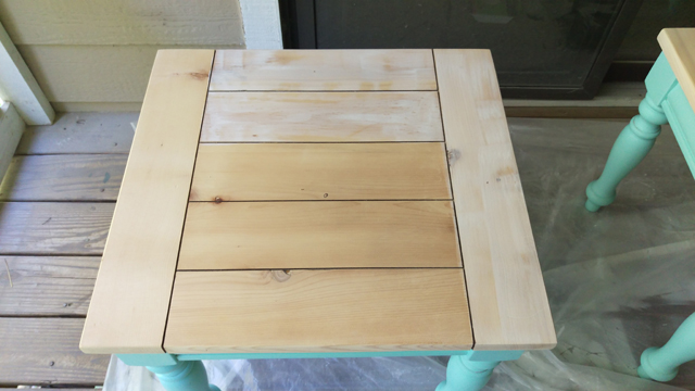
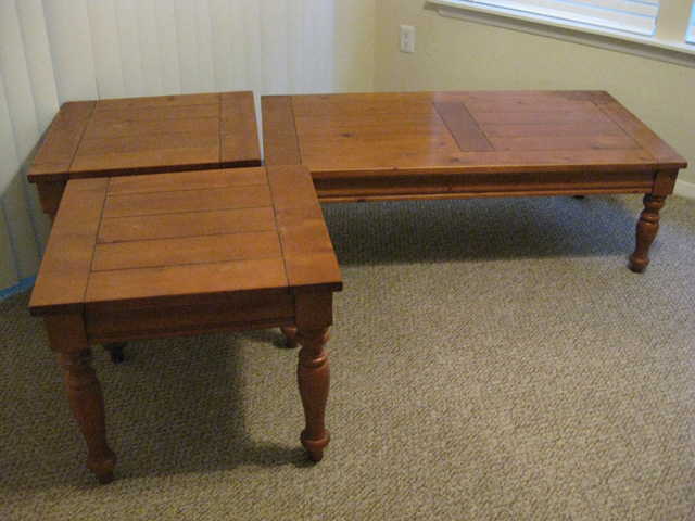
We’ve had the tables for nearly six years now, and they’ve served faithfully. But they definitely weren’t much to look at:

2015-06-21_01_Tables-Before

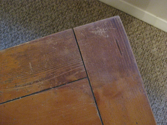
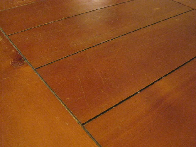
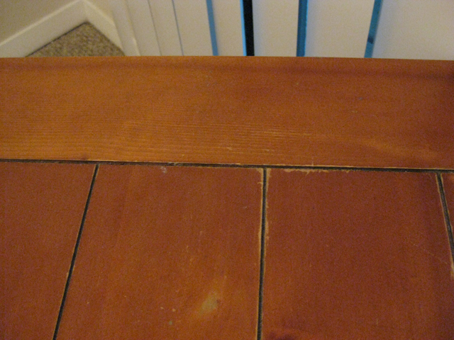
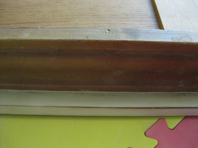
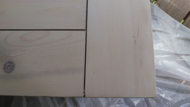
The orangey stain wasn’t our favorite (is it anyone’s?), but what really counted against them was the condition of the tops. On closer inspection you’ll see there was water damage…

2015-06-21_02_Water-Damage

…scratches…

2015-06-21_03_Scratches

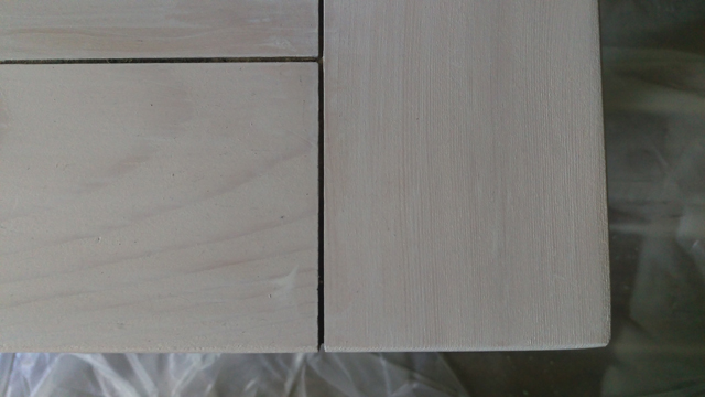
…and chipped/scuffed stain.

2015-06-21_04_Chipped-Stain

Oh my. We were tempted to replace them, but everything we liked was a little out of our price range for now, and these tables still had plenty of useful life in them. I mean, they can still hold a lamp and a cold drink, so there was no call for sending them to the curb just yet. The only question that remained was whether to stain them or paint them. I couldn’t decide which idea I liked better, so I decided to do both: whitewash stain for the tops and a fun paint color for the legs. And since our living room is crying out for more color (rentals—what are ya gonna do?), I decided to spend a little extra money, take a bit of a design risk, and do the coffee table in a different color than the end tables.

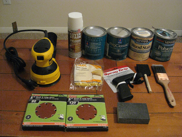
I turned to veteran furniture makeover-er Kate of Centsational Girl to help me pull together a list of necessary materials. Although she’s done a couple two-toned pieces, her post on a blue bureau and her favorite furniture paint was the jumping off point for my own makeover process.

2015-06-21_05_Makeover-Supplies

The sander, a DEWALT 5-inch variable speed random orbit sander (ROS), was purchased specifically for this project. I picked up 80 grit and 120 grit sanding discs at the same time, but later went back for 60 grit and 220 grit. I had the medium-grit sanding block from a previous project, but ended up buying 120 grit and 220 grit sandpaper because they were easier to maneuver around the tables’ curvy bits. I bought the spray grip for the primer on Kate’s recommendation, and I don’t think I’ll ever spray paint without one again, because it makes the process so much less hand-cramp-inducing. The foam brush was for the stain, the synthetic bristle brush was for the Polycrylic, and a short-handled natural-bristle angle brush (not pictured, whoops!) was for the paint. Also not pictured: drop cloth, respirator, safety goggles, and cotton rags.

Now for the fun bit: the paint and stain choices. Kate recommends a water-based alkyd enamel for furniture. It’s more expensive than latex, but it dries harder, which means no perpetually slightly tacky paint that tends to stick to anything left sitting on it too long. She notes that it’s especially good for things that will get a lot of use, like tabletops and dressers. Now, I wasn’t planning to use the paint on the tops of the tables, but we tend to drag and push on the coffee table a lot, and I know that I can get a little wild with my vacuuming, so I wanted a finish that wasn’t as likely to scratch, chip, or peel over time.

Of her two paint recommendations, I decided to go with the Sherwin Williams ProClassic Interior Waterbased Acrylic-Alkyd Enamel, because I know that Lowes sells SW paint. Well, it turns out they sell a very limited selection of it, and that’s not one of the products they carry. So I hit up an SW store to get swatches of colors I’d checked out online (an aqua and a dark teal) and get the paints mixed. When I went to place my order, the associate explained something that Kate doesn’t mention in her how-to: the ProClassic Interior Waterbased Acrylic-Alkyd Enamel is only available in the Extra White base, which means it can’t be used for dark colors like the teal I had picked. They gave me two alternatives: the ProClassic Interior Acrylic Latex Enamel, which comes in both the Extra White and Deep Base, and the All Surface Enamel Latex, which only comes in the Deep Base. Both are water-based products that dry hard like traditional oil-based enamels.

The ideal choice would have been to go with the Interior Acrylic Latex Enamel for both colors, but they were completely out of the Deep Base in satin finish—my preference for this project—and weren’t expecting any for at least a week. Being the impatient person that I am, I bit the bullet and decided to do the the lighter color in the Interior Acrylic Latex Enamel and the darker color in the All Surface Enamel Latex. I figured it would be a relatively low-risk way to see if I liked one over the other, because if I completely hated it, I could always go over it with a different paint and pretend that the first try never happened.

For the stain, I chose Minwax’s Whitewash Pickling Stain. It imparts a nice color that reads as white but still allows some of the wood grain to show through. Conveniently, it’s is also water-based: I already had half a can of Polycrylic left from a previous project that I could use for the topcoat, and I’m big on easy clean-up.

The first step was to sand the tops down to bare wood. I attacked them with the ROS with progressively finer sandpaper, starting at 60 grit and working my way to 220 grit. This took more patience then muscle, but it definitely took several evenings after work before I’d stripped all three tops. I then completely failed to take a photo of the stripped tops (or lost it somewhere between the camera and computer), so you’ll have to use your imagination.

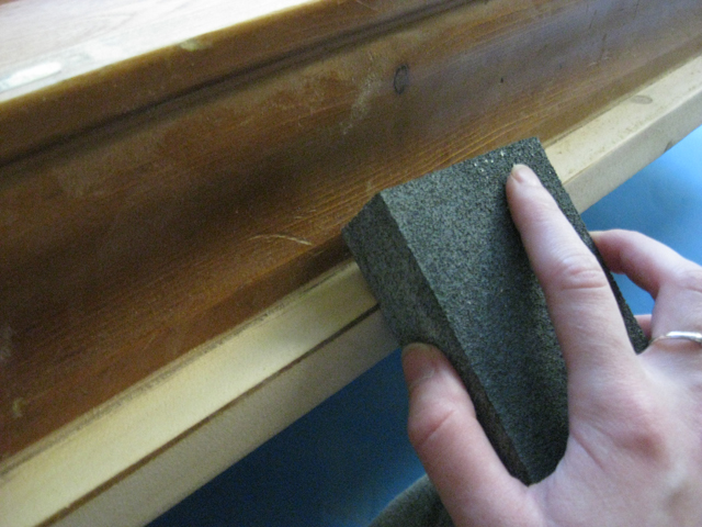
Because the tops have a lip that hangs over the edge of the base by about a half inch, I flipped the tables over and sanded the underside of the lip as well.

2015-06-21_06_Detail-Sanding

To get that skinny line between the faces of the lip, I used a medium-grit sanding block and moderate pressure.

2015-06-21_07_Detail-Sanding

(You smart people undoubtedly know this already, but it bears repeating, if only as a reminder to myself: take off your jewelry before you do any hand-sanding. The underside of my ring got pretty scuffed from this part of the job.)

I also used 120 grit sanding sheets to rough up the rest of the table to take some of the shine of the topcoat off. This probably wasn’t strictly necessary considering I used Zinsser Cover Stain Primer, which the internet leads me to believe can adhere to and cover up basically anything. But it didn’t hurt either, so rough up at your own discretion. I followed up with a tack cloth all over all pieces to remove the sanding dust.

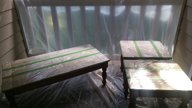
I chose to paint first and stain second, following the Kate’s lead on a similar (but less complicated) two-tone table makeover. To avoid any painting boo-boos, I covered the tops of the tables with plastic cling film and sealed the edges with Frog tape.

2015-06-21_08_Prepped-for-Priming

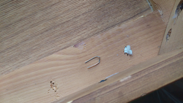
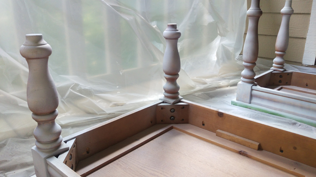
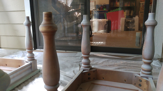
The wood underneath the orange stain was lovelier than expected, and we considered leaving it unstained and simply sealing it. But the plan won out, so I flipped everything over to prime the bases. It was only then that I realized there were several staples poking out, some of which trapped bits of plastic and old tags. I went ahead and removed those just to avoid any stabbed or sliced fingers down the road

2015-06-21_10_Removing-Staples

Once coat of primer provided decent coverage where I got the table…

2015-06-21_11_One-Coat-Primer

…but the curvacious legs made it difficult to get into every corner, and I was running low on primer by the time I made it around to the last leg.

2015-06-21_12_One-Coat-Primer

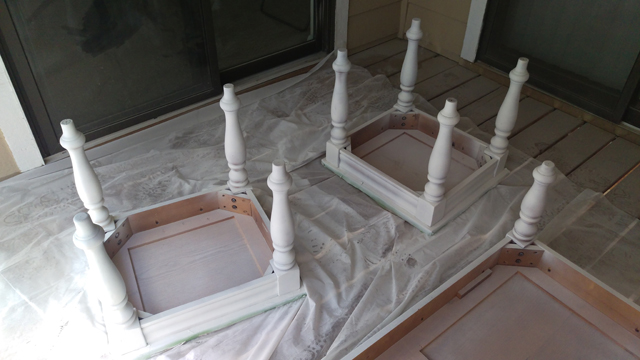
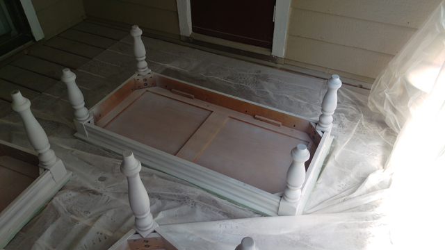
A second can and second coat of primer did the trick.

2015-06-21_13_Two-Coats-Primer

2015-06-21_14_Two-Coats-Primer

With the prep work done, it was time to get on with the real transformation: the paint!

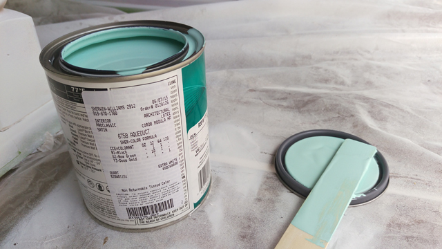
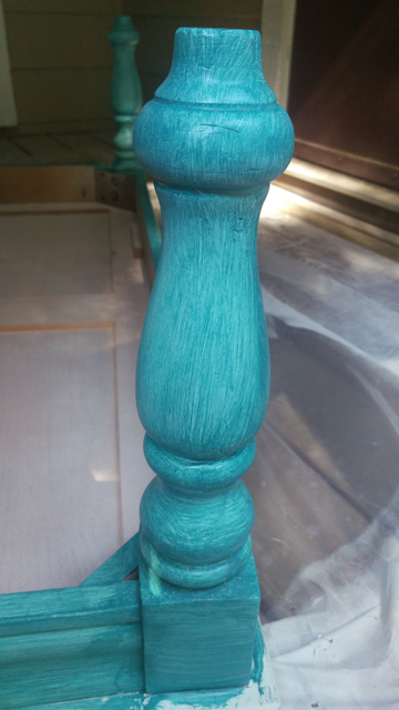
For the end tables, I chose a light aqua, Sherwin Williams Aqueduct in Satin.

2015-06-21_16_Aqueduct-Preview

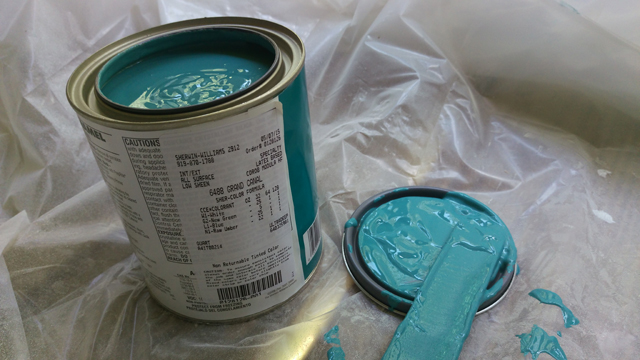
For the coffee table, I chose a dark teal, Sherwin Williams Grand Canal in Satin.

2015-06-21_17_Grand-Canal-Preview

From the names alone, I knew they belonged together. I did panic a little when I started to actually paint because they went on lighter than they appear in the can, but like any other paint they’re darker dry than wet. The swatches were to true to life, which was a relief.

If you compare those two images, however, you can probably tell that those paints do not have the same viscosity. The ProClassic Interior Acrylic Latex Enamel is similar to a latex wall paint, but the All Surface Enamel Latex is the consistency of warm ketchup. As a result, it was more difficult to get thin and even coats with the latter. I resorted to vigorous back-and-forth brushing to spread the paint, rather than long parallel strokes, which left visible brush marks; combined with the dark color, this meant more coats were necessary to get full and even coverage.

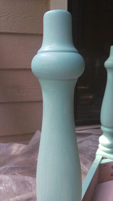
To illustrate, here are the end tables after one coat:

2015-06-21_18_One-Coat-Aqueduct

2015-06-21_19_One-Coat-Aqueduct

And here’s the coffee table after one coat:

2015-06-21_20_One-Coat-Grand-Canal

In total, the end tables required two coats and the coffee table required four. You have to wait four hours between coats with both products, so it definitely slowed down the process.

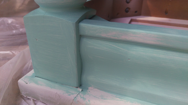
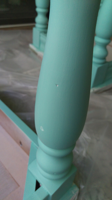
Once the last coat had dried, I noticed there were still a few spots that hadn’t taken paint.

2015-06-21_21_Two-Coats-Aqueduct

(Some may choose to fill dents like these with wood filler before priming. I didn’t bother. I think they add character. Also, there are a bunch of them, and all of them are pretty inconspicuous, so the payoff didn’t seem worth the extra time and effort. Your mileage may vary.)
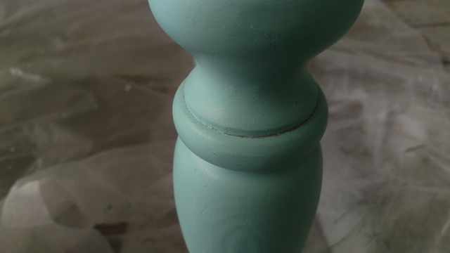
2015-06-21_22_Two-Coats-Aqueduct

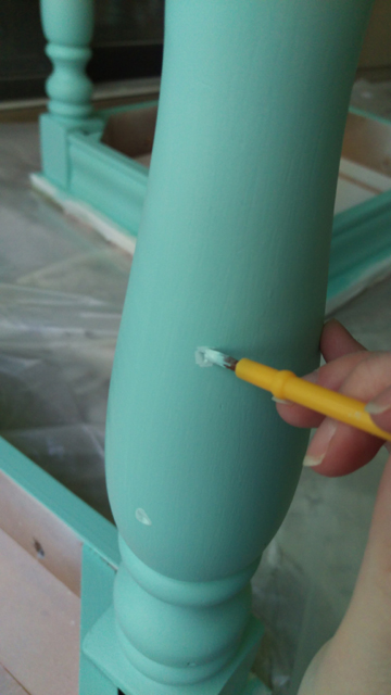
I picked up cheap (but not too cheap—they still have to be soft) watercolor brushes at the local craft store to touch up the nooks and crannies.

2015-06-21_23_Two-Coats-Aqueduct-Touch-Up

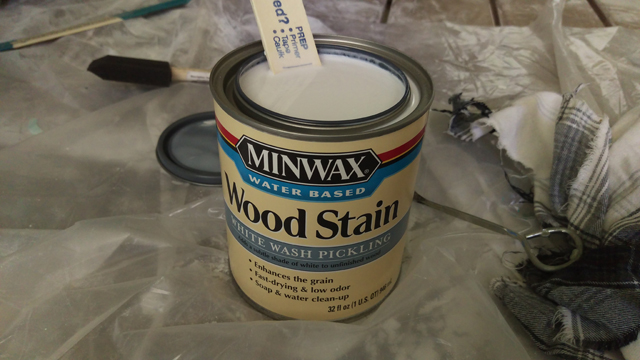
Once everything had dried for at least 24 hours, I peeled off the protective plastic cover and cracked open the stain. It’s runnier than paint but not as thin as water; it’s probably closest to Polycrylic in stir-ability.

2015-06-21_24_Whitewash-Preview

I used a cheap foam brush to apply the stain; I aimed for thin and even coats. The instructions say not to allow it to sit for more than 3 minutes before wiping. Now, I generally regard these kinds of instructions as guidelines only. In this case, however, I would say that they are not kidding. The minute you brush on the whitewash stain it starts to become unbelievably sticky, so if you don’t wipe it off within three minutes it’ll be too gummy to get it off properly. I paused to take the photo below while applying the first coat and regretted it. When I went to wipe off the excess, it smeared and left uneven patches of color. They were especially noticeable because the first coat is so subtle.

2015-06-21_25_Whitewash-Application

Here’s two coats.

2015-06-21_26_One-Coat-Whitewash

The third coat is more discernible, but still quite faint.

2015-06-21_27_Two-Coats-Whitewash

I liked that the wood grain was visible, but I didn’t like how faint the white was after three coats. At this point, I decided to gamble. I’d had great success staining pine nightstands a rich espresso color by using Varathane’s water-based stain in Kona and simply brushing it on and then leaving it to dry. So I painted on another coat of the whitewash, this time quite thickly so that the stain would stay wet on the surface longer and allow me to go back and smooth out lap lines, and didn’t wipe it at all. (So rebellious, I know.) Lo and behold, the sky did not fall, the tables did not catch fire, and no one broke down my door to arrest me for ignoring the label.

Ultimately, the nightstands got five coats of whitewash (three light coats + two heavy coats) and the coffee table got three (one light coat + two heavy coats). There’s no distinguishable difference in final color.

One downside to this approach was that I ended up with stain in the cracks (for some reason, the cracks repelled any little drops of stain when I used a lighter hand). I was afraid of damaging the surfaces by scraping the cracks with something sharp like a straight blade, to say nothing of dulling the blade, so I used a plastic knife to chip out the stain. Well, peel it out is more apt, since the gobbets in the cracks were sticky.

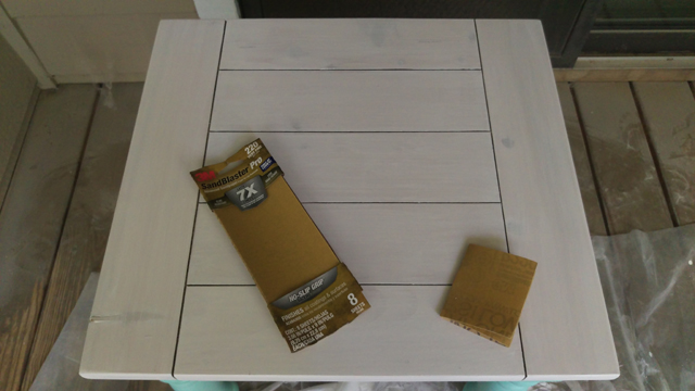
The last step was to lightly sand the whitewash, which was slightly tacky even after fully drying, with fine sandpaper to prep it for the topcoat.

2015-06-21_28_Prep-for-Sealing

I followed up with a tack cloth, then a damp rag, then a dry one. To be extra sure there was nothing lurking in those cracks, I used our regular vacuum cleaner to them a once over.

I applied two coats of Polycrylic with a synthetic-bristle brush over the painted and stained portions of the tables. Because we had a spate rainy days, I brought everything inside to seal and dry—don’t worry, I made sure the living room floor was covered and the air was well-ventilated—so there are no photos of this step.

Everything got another 48 hours or so to fully cure. What had once looked like this…

2015-06-21_01_Tables-Before

…now looks like this!

2015-06-21_37_Coffee-Table-After-Collage

2015-06-21_38_End-Tables-After-Collage

A huge improvement, no?

This was definitely a learning experience, and if I were to do it again, there are some things I would do differently (not the least of which is avoiding anything that has so many crevices that must be painted or not-painted). For one thing, I’d take a lighter hand when sanding to prep for the topcoat; I wasn’t gentle enough in spots and the wood shows through ever so slightly along a couple of the edges. For another thing, I would be more careful with the vacuum cleaner. While trying to get every last bit of dust out of the cracks, I left a few dark scuff marks, but I didn’t notice them until after I started applying the topcoat, so they’re sealed in forever. Is the finished product less than perfect? Yep. Are these things deal-breakers? Absolutely not! It’s all par for the course.

We’re so pleased to have the tables back in use and looking so pretty. They are, however, putting the lamps and throw pillows to shame, so I’m hoping to give those a little TLC next. Cheery colors for all the things!

Maker Moment: Cross-Pollination

Justin and I are both creative people, but we have very different hobbies. Whereas I gravitate toward pursuits that produce tangible results like sewing, knitting, writing, painting, and building, he prefers activities that are more experiential. He especially loves games. He plays board, card, and video games with equal fervor. He’ll play solo, one-on-one, or in big groups; he’s equally comfortable playing with close friends and total strangers. He collects games, curates them, and shares them. He’s nostalgic for the games of his childhood, but also loves to keep up with what’s new. He has a soft spot for games that are historically or culturally significant, even if they’re bad.

I also enjoy games, but to a different degree than he does. He likes to help me with my DIY projects, but he doesn’t have the same dogged determination about them that I do. As you can imagine, we each sometimes struggle to appreciate what is so compelling about the other’s hobbies, since we’re attracted to such different kinds of experiences.

Nevertheless, he’s incredibly supportive of my crafts, even if he’s not particularly interested in doing them himself. So on Thursday when I told him that I got an email saying that Hancock was having a sale on McCall’s patterns for $1.49 each (seriously, go check it out—it’s almost as good at the 5-for-$5 Simplicity patterns they sometimes offer), he had his shoes on and his car keys in hand before I could look up from my phone to see if he’d go with me.

To make things fun, we decided to look through the patterns separately and then compare notes on which ones we liked. I was pretty sure that we’d pick at least a couple of the same patterns, but there was no overlap at all, despite the fact that I had pulled out about 20 and he’d grabbed 7.

With nearly 30 patterns on the table, I had to do some serious culling to stay within the 10-patterns-per-customer limit. Justin very helpfully offered to buy 10 as well, but once I started cutting contenders it got easier. First, I set aside anything that didn’t excite me or that felt aspirational: styles that I want to like because they’re popular or easy to wear, but don’t fit my lifestyle or my dressing habits. Next, I looked for duplicates: any patterns that were similar to others on the table or others I knew I had in my stash did not survive the chopping block. Finally, with a few patterns left to eliminate to get within the limit, I considered which patterns were the most efficient (for lack of a better word): ones that I would make or wear over and over again, ones that fill holes in my current wardrobe, ones with multiple styles options or the potential for pattern hacking. The inefficient patterns went back in the drawer to be found and loved by someone else.

As is usually the case when I’m working on a project and Justin is nearby, I narrated throughout the process, occasionally soliciting his opinion or advice. When I got to step two, where I was concentrating on weeding out duplicates, he said, “This is just like deck-building.”

In competitive card games like Pokémon or Magic: The Gathering, at least 50% of the game consists of assembling one’s deck of cards before playing. Players select an assortment of character, resource, or event cards that they can then play, individually or in combination, against their opponent in order to achieve the game’s objectives (which, in Pokémon and MTG, consists of “attacking” one’s opponent until their health counter reaches zero and they’re knocked out). Much of the discussion for these games revolves around different strategies to win and which cards work well together or can be played in more than one way. Once a player puts together a deck, they’re often encouraged to consider what the weakest or least effective card in the deck is, and how they might replace it with a more effective card or eliminate it entirely.

Watching me weigh various options, Justin saw someone who was building a “deck” of patterns, where the goal was to create a wardrobe of outfits that suit the kind of activities I do while looking and feeling good to wear. (Bonus if they’re also fun to sew.) Just like in deck-building, options that didn’t really fit in with the others I was looking at were bypassed in favor of ones that created a more cohesive set, and options with more than one use were preferred to ones that were more limited.

I had never thought of pattern shopping in this way, had never considered that our two apparently disparate hobbies could share a common language. It’s fascinating to think that a system so specifically crafted in one context could be so readily applicable to another context that it does not overlap in any way.

Of course, there are certainly elements of each context that have no analog. For instance, while many decks are built to win, there are also decks that exist simply because they’re fun to play, with little to no chance of success; in sewing, even just-for-fun pieces, like costumes, or impractical pieces, like a dress made entirely of fringe, would need to fit well enough for someone to wear.

But by finding this common language, I was able to communicate my goals more clearly, and Justin was able to offer more constructive advice. I have a new way of thinking about my own purchasing process—and who knows? Maybe next time it will make things even faster and easier. If nothing else, we both walked away with a better understanding of why the other is so intrigued by the complexities of our respective hobbies. 

Have you ever experienced a moment of cross-pollination like this? Do you have two unrelated hobbies that share an unexpected connection? Does your passion for something help you to better understand someone else’s passion when you otherwise just wouldn’t get it?

Wardrobe Architect Week 8: Hair, Makeup & Beauty

Now there’s a loaded topic if ever there was one. Rather than waxing philosophic about the whys or why nots, let’s stick with the facts: what I do, what I don’t do, what I’d like to do, and, let’s be honest, what I’d like to do but probably can’t be bothered with. Sarai provided a very helpful list of nine questions as a jumping off point, so I’m going to start with those and see where it takes me.

1. What hair style has been most flattering and comfortable for you? How did it make you feel about yourself? Did it invoke any of the words you came up with in our core style exercise?

Apart from growing my hair out until I could sit on it and then lopping it all off when I was nine—I got a pixie-ish haircut that was wedge cut in the back—I’ve kept my hair between shoulder and chest length all of my life. Anything shorter than that doesn’t feel like me, and any longer than that is just too difficult to manage. I love layers but don’t wear bangs. My two favorite haircuts looked like this:

2015-05-13_12015-05-13_2

If I could master doing my own hair, or had unlimited access to someone who would do it for me (a girl can dream!), it would look like this:

2015-05-13_4Source

2015-05-13_3Source

Long hair has always felt versatile to me, which is why I like it. Want to keep things simple? Blow it out straight and wear it loose. Want to exude classic elegance? Pull it into a sleek bun or French twist. Want to feel glamorous? Style it as a cascade of curls or waves. Too tired or too busy to fuss with it? Messy buns and claw clips are your friend.

My favorite hairstyles, on good hair days, make me feel like a supermodel. Or a superhero. I feel unselfconscious, feminine, poised. I’m ready for anything. Bring on the wind machine!

2. How much makeup are you comfortable with?

If I feel like wearing makeup, then I’ll do a full face: primer, foundation, powder, blush, eyeshadow primer, eyeshadow, eyeliner, and mascara. (I seldom wear lipstick, even with a full face, but that’s mostly because I haven’t found the right shades yet or the best way to get it to stay put.) But most days I don’t feel like wearing makeup. Even with some practice, I’m not as fast as I’d like, or as creative, or as skillful, and most mornings these days I’d rather hit the snooze button.

This is something I’d like to change, though. I like the way I look in makeup. I like the expressive potential. And some days, I like that it feels like armor against the stresses of dealing with overbearing sales people or socializing with strangers. I—and this is just me talking about my personal experience, not making normative statements or passing judgment—see wearing makeup as another component of feeling put together in my daily life. It’s another element that gets added up with dressing well according to a sense of personal style, being prepared, speaking confidently, and acting decisively. Not wearing makeup isn’t a pass/fail switch; it’s just one more thing that can add to or detract from my sense of being capable of getting my act together. Since it’s a thing that takes time and attention, the fact that I have makeup on means that I deliberately made time for it and gave it my attention.

3. How does your makeup and hair reflect your personal style? What do you feel they say about you and your aesthetics?

My hair and makeup routine are about 50% there in terms of reflecting my personal style. I’ve found the length and general style I prefer for my hair, and feel comfortable trying variations within those parameters. Likewise, I’ve found a couple of color palettes that work well with my complexion and my favorite outfits, and I’ve begun experimenting with different combinations of things like eyeshadow and blush.

Thus far my attitude about hair and makeup has been pretty flexible: I don’t like to agonize over either, and I’ve been okay having a couple of days a week where I put in little or no effort. They’ve reflected my belief that I don’t have to do anything I don’t want to, and that applies to both ends of the spectrum: I don’t have to wear makeup (or fancy clothes, or a perfectly coordinated handbag) if it feels like work instead of fun, and I don’t have to feel guilty if I want to lavish time on myself to perfect a look (via makeup or aforementioned clothes and handbag). I’ve more than proven to myself that I’m comfortable keeping things simple even when those around me are decked out; now, I’d like to take everything up a notch by learning to consistently execute my favorite looks.

4. How much product do you want to own? Do you like collecting products, or would you rather just have a few essentials? How much bathroom clutter are you OK with?

Moderation rules when it comes to my beauty products. I’m not a collector, but neither do I find minimalism particularly appealing (and I have no interest at all in enforcing an arbitrary minimalist policy). I gravitate toward the practice of having a core group of products that I keep coming back to, supplemented by a small, changing collection of products that I’m trying out or only using seasonally/sparingly/for specific occasions.

5. What requirements do you have for the products you buy? Do you stick with all-natural products? Are there ingredients you avoid?

My only requirement for beauty products right now is performance: I choose whatever does the best job for me. Sometimes this is an all-natural product, often it’s not. I’d avoid any ingredients that irritated my skin, but I’ve not found any yet that produced a severe reaction.

6. What colors feel best near your face? How do they relate to the color palette you created?

I love how teal makes my eyes look more blue, which is probably why it’s included in my color palette. Rose gold and peachy shades were a surprising discovery for me, although for now I think I’m more comfortable with makeup in those colors than clothes.

7. What colors never look right near your face? What colors have you tried and given up on before?

Cool pinks and purples don’t work for me, at least not in makeup form. I’ve always viewed yellow and orange clothes as suspect, although that stems more from a fear that they’ll look bad than from any bad experiences.

8. How much time do you realistically want to spend getting ready in the morning?

About an hour, including time to shower, dress, brush my teeth, do my hair and makeup, and find my shoes, which are never where I thought they put them.

9. What types of scents do you gravitate towards? Do you wear perfume? Other scented products? What do you feel the scents you like communicate about your personality?

Fresh, crisp scents are my favorite. I like the smell of clean cotton sheets, fruit (except peaches), foliage, and delicately scented flowers. I avoid anything that smells like baby powder. I don’t care for spicy fragrances and heavy florals; anything too rich tends to feel more mature (if you know what I mean) or more sexy than I care for and not really me. I like perfumes that convey youthfulness without being overly sweet. While I want my clothes to communicate that I’m a bit polished and classy, I want my perfume to suggest that I’m not fussy or forced.

Of these questions, I found #2,#3, and #8 most helpful to think about, but I’ll admit I’d never even thought about #9 and scents as an element of personal style before. Which question do you find the most interesting? Do you think about your beauty routine the same way you think about your wardrobe?

Surfacing

The last ten days have been such a rush of events that I actually had to look at the calender and count back to be sure that it hadn’t been longer. In that span, we bought a car; we tried and failed to figure out why our washer has started to sometimes overflow during a cycle; Justin started a new job; we both stayed home from work due to weather; we entertained a house guest for two days; and Justin came down with a nasty cold that he’s still in the thick of.

All of this is to say that very little in the way of creative endeavors has been happening around here lately. Quite frankly, it makes me itch—I’m much more even-keeled when I’m making steady progress on something. That’s why I had to blog, even though I don’t have anything to share today: this is a thing I enjoy and not doing it, even when there are no deadlines and I know everyone would understand, makes me feel antsy and disconnected.

I expect everything to normalize by the end of the week, and I hope to have at least one new project to share. In the meantime, might I direct you to a favorite blog of mine, Things I Make. Plus Rocks., which today is showcasing adorable pictures of furry woodland creatures from the Yukon? The mountain goats are my favorite—what’s yours?